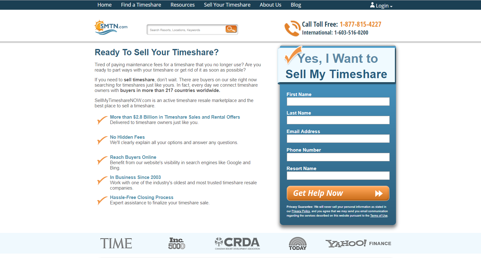
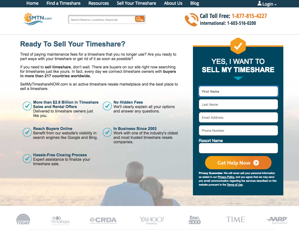
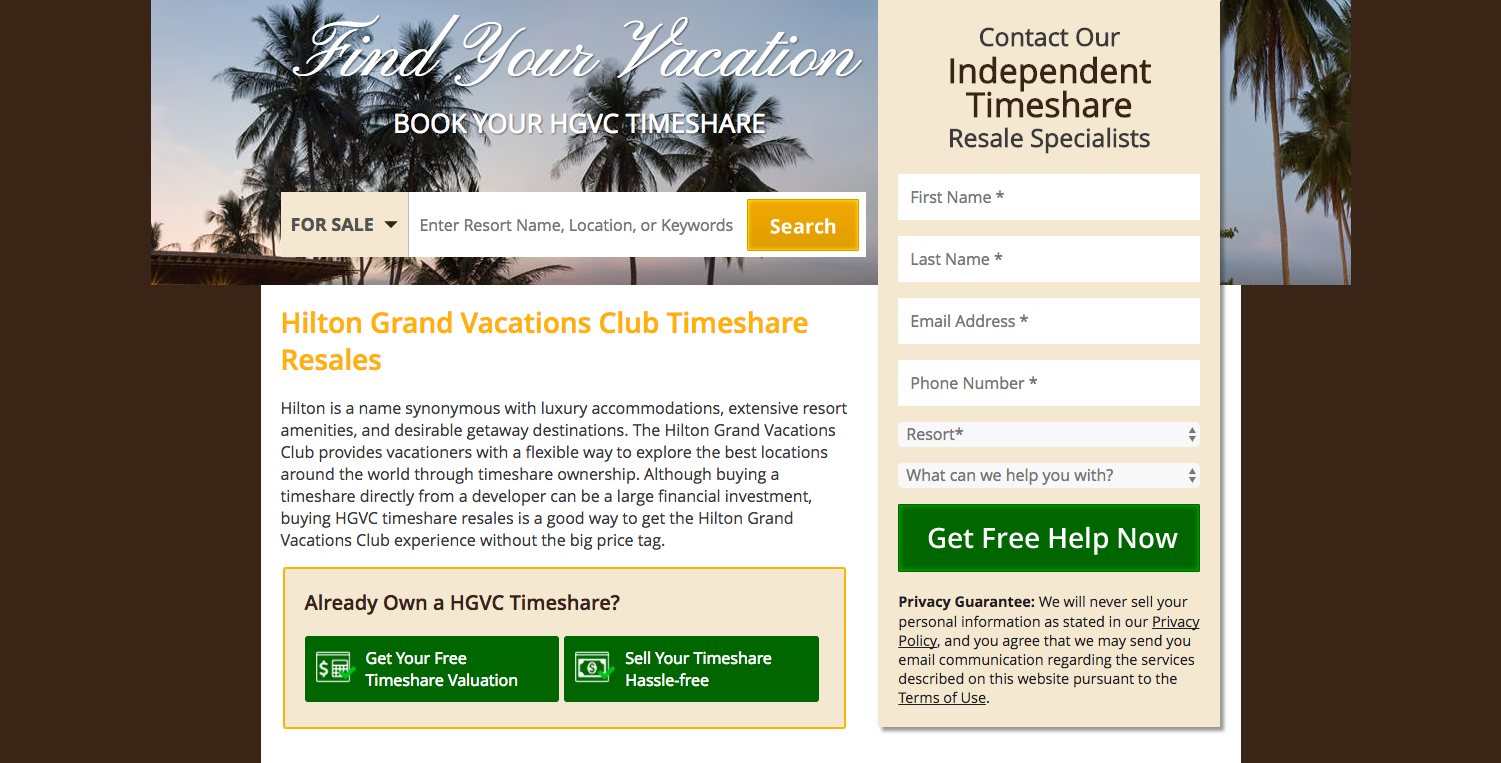
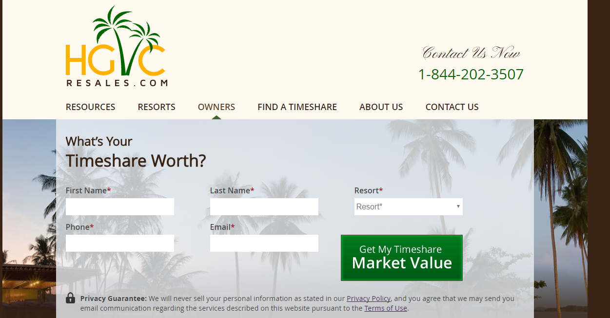
Testing new design elements in a modified version of the sell time page. The cleaner, more modern look is more professional and will result in improved retention and conversion. This version of test includes original bulleted copy in place of the process graphic.
Displaying 9 of 629 experiments
Larger Form Fields – Sell Timeshare
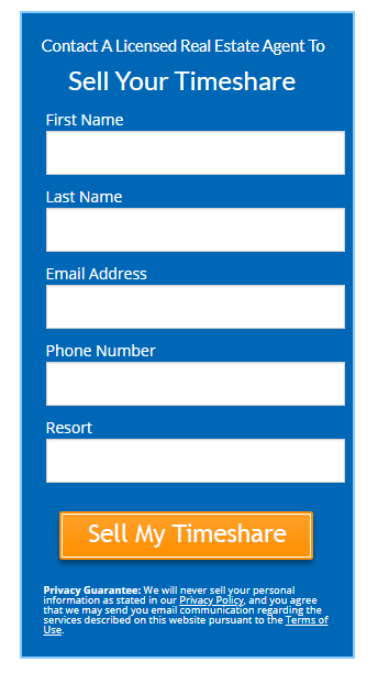
The owner sell page has a high bounce rate. Since TBS is already seller-friendly, simply making the form fields larger and more eye-catching may produce a greater number of leads and reduce bounce rate.
Brand Suite Mobile Fix
Fixing the header and footer containers so they are the same width as the body content will improve legibility, navigation and overall perceived quality.
Home Page Owner Block
Create a more pronounced owner block on the homepage to drive more traffic into owner conversion funnels.
Mobile Optimized
Leveraging a mobile-optimized design will improve user experience for mobile device users, increasing retention and conversion rates.
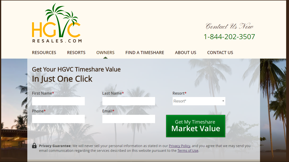
HGVC WMTW Headline
Improving the headline text on the /hgvc-timeshare-worth/ page to include more enticing language. Similar tests on other sites have yielded positive results, mainly a lift in MVS goal completions.
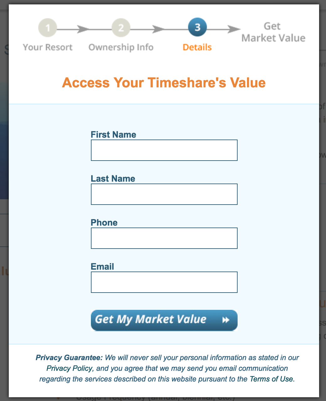
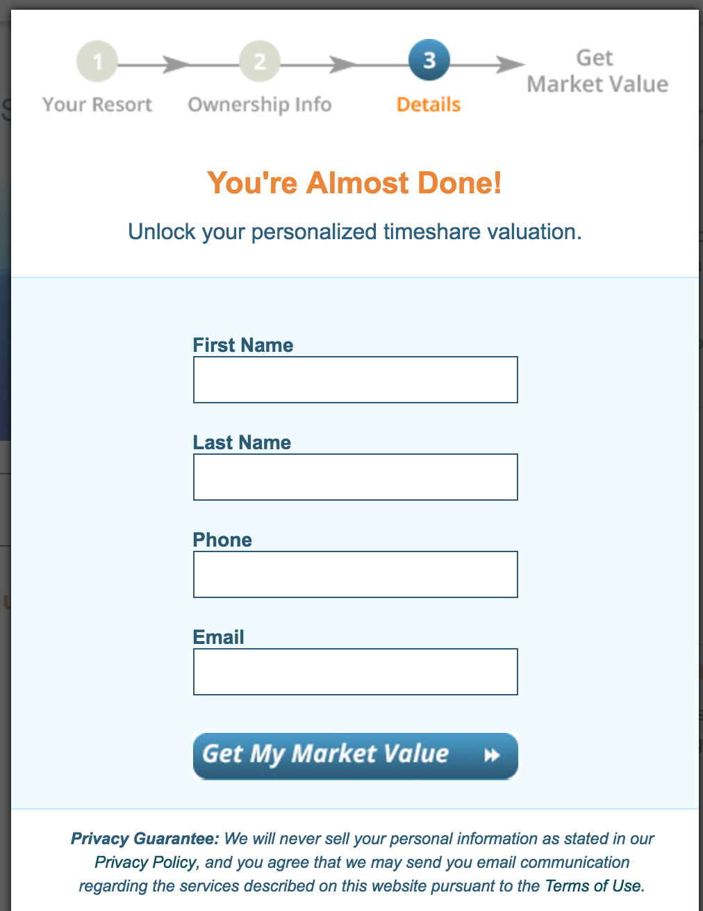
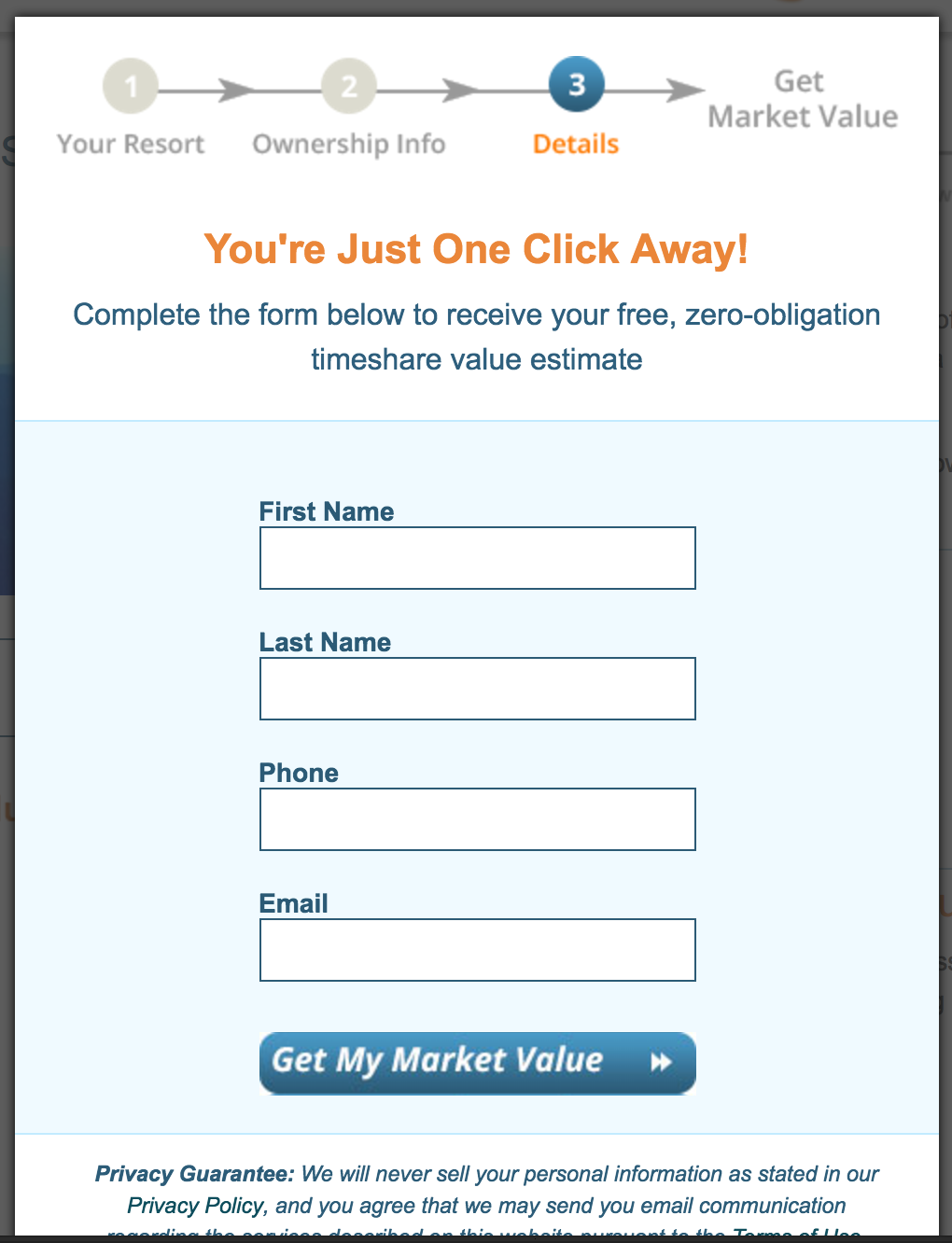
WMTW Step 3 Headline
Testing different language on step 3 will increase user motivation.
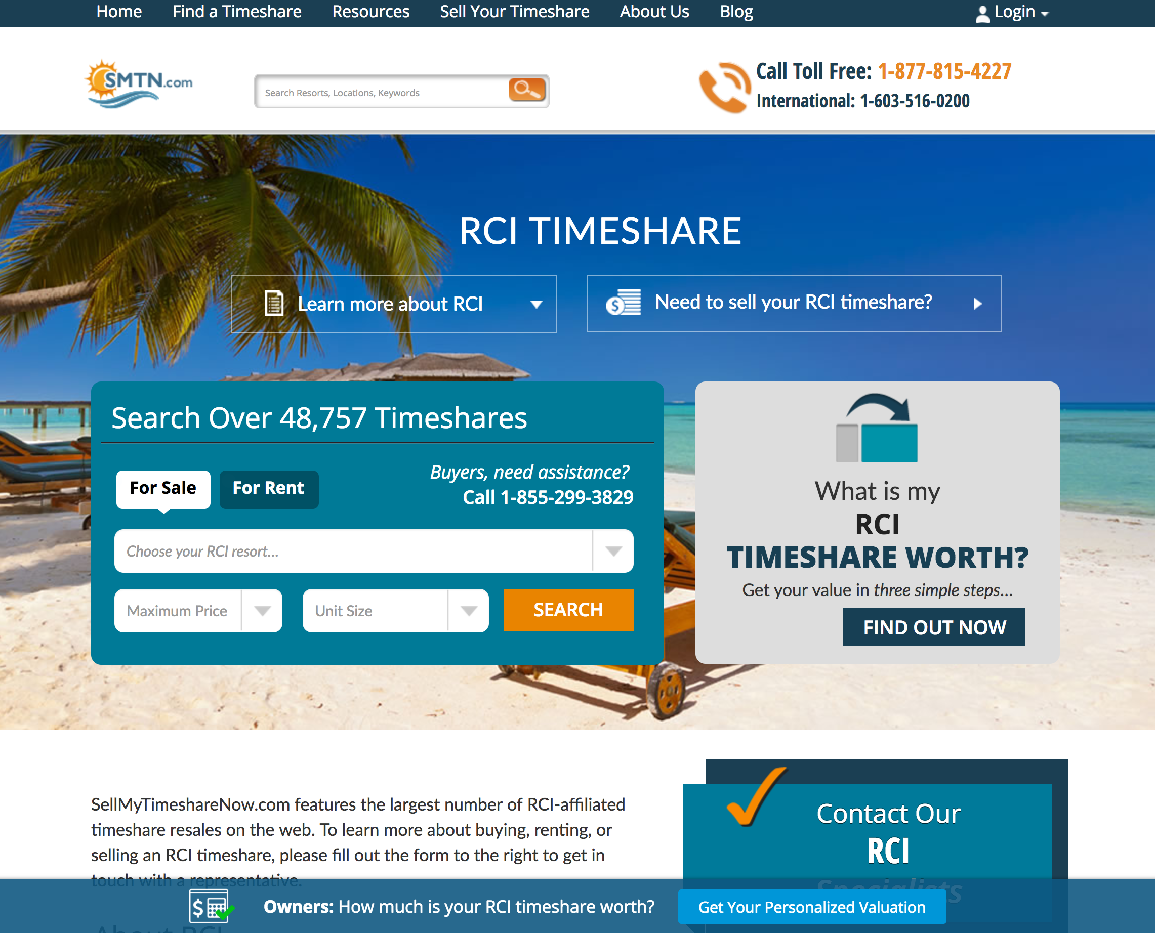
Owner Utility Bar (RCI)
Testing the utility bar on brand suite to see if it has the same impact on Market Sell CVR as it did elsewhere on the website. Exposure for the WMTW form feature is diminished on site. Adding an ever present utility bar will increase visibility for this feature, attracting more owners to the form funnel and ultimately converting more
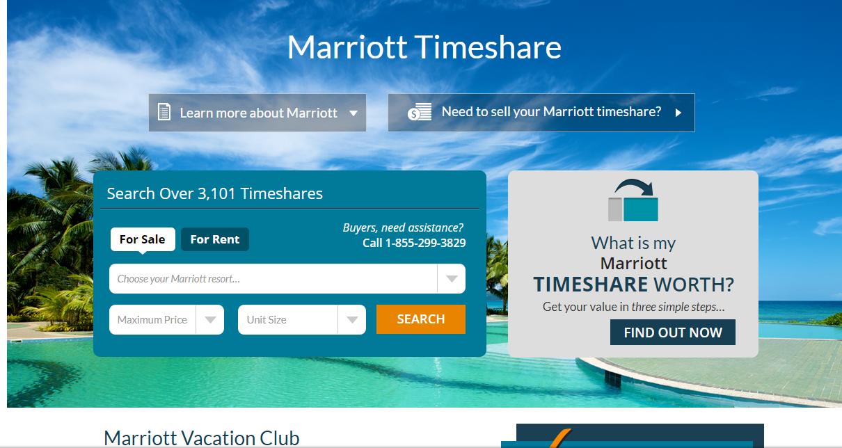
Utility Bar (Exclude Brand Suites)
Adding a utility bar to the bottom of user's window will give more visibility to the WMTW page.