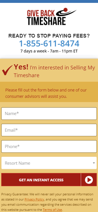
Moving the form farther up the page for mobile devices will put it in front of more eyes, increasing conversions.
Devices
Moving the form farther up the page for mobile devices will put it in front of more eyes, increasing conversions.
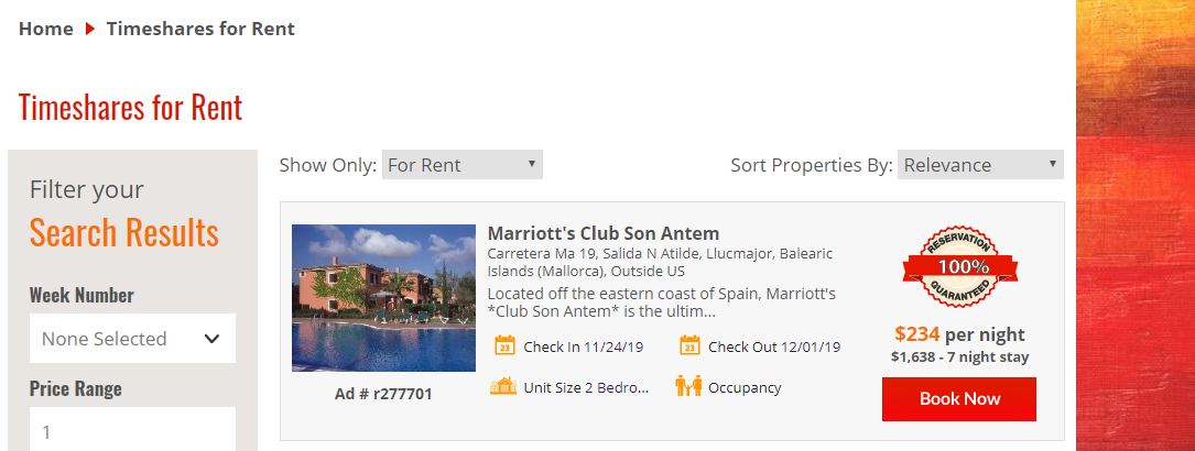
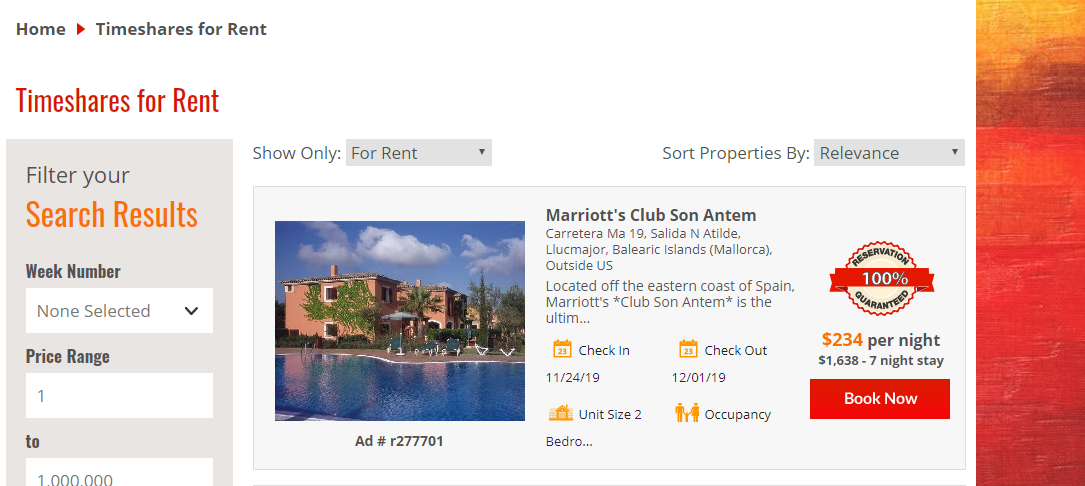
Increasing the sizes of images, text, and other information on resale inventory experiences will create a better user experience for potential buyers, boosting offer CVR
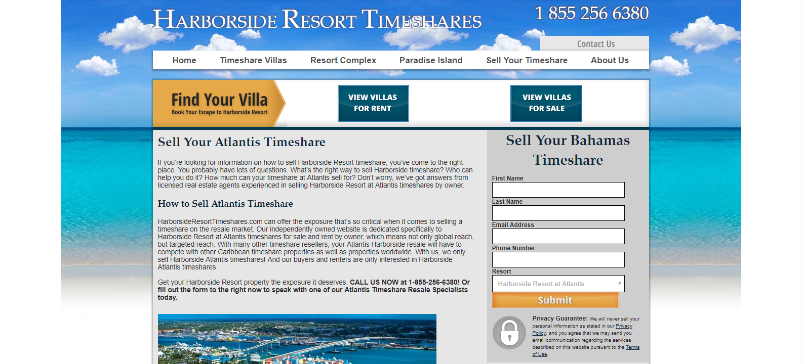
With the failure of Version 1 of this test, we'll try a more subtle approach at enhancing the sell timeshare form. Instead of completely changing the color scheme, we will make minor improvements such as increasing form field height, fixing spacing issues, and adding other stylings to make this form more noticeable.
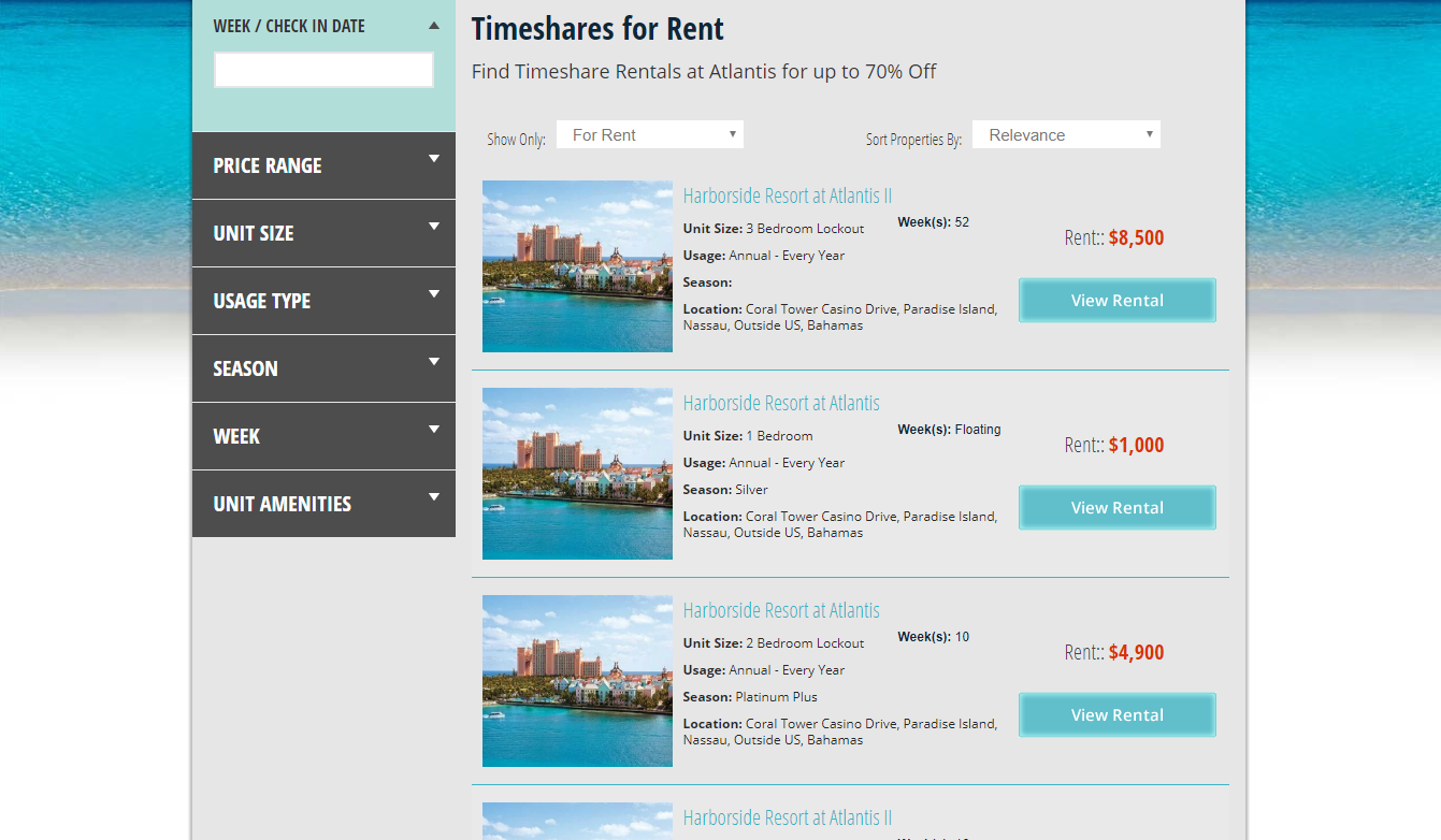
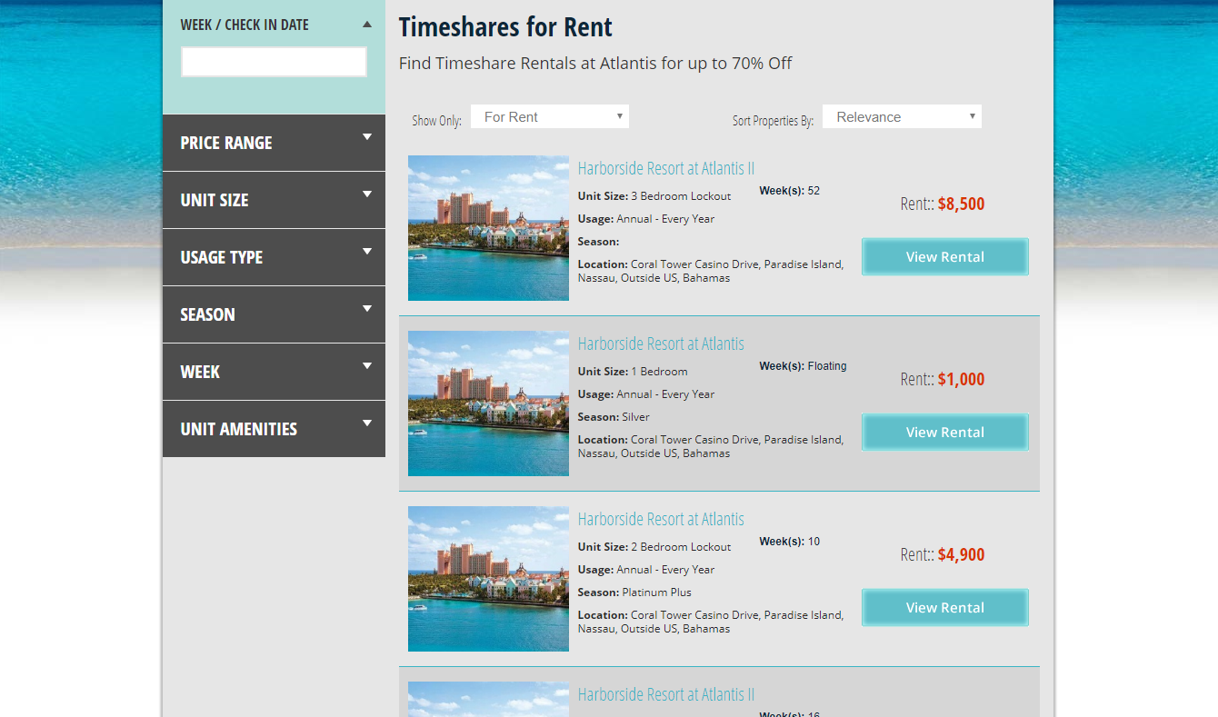
Current inventory experiences on this site can often be monotonous to the user, as all the listings share the same thumbnail image, title, color scheme, and oftentimes a similar price. To create a better dynamic and increase separation between listings, we'll darken the background of every even numbered listing to make inventory pages more appealing to the eye.
Improving the image size and overall appearance of inventory listings will encourage more user interaction, and therefore, more conversions
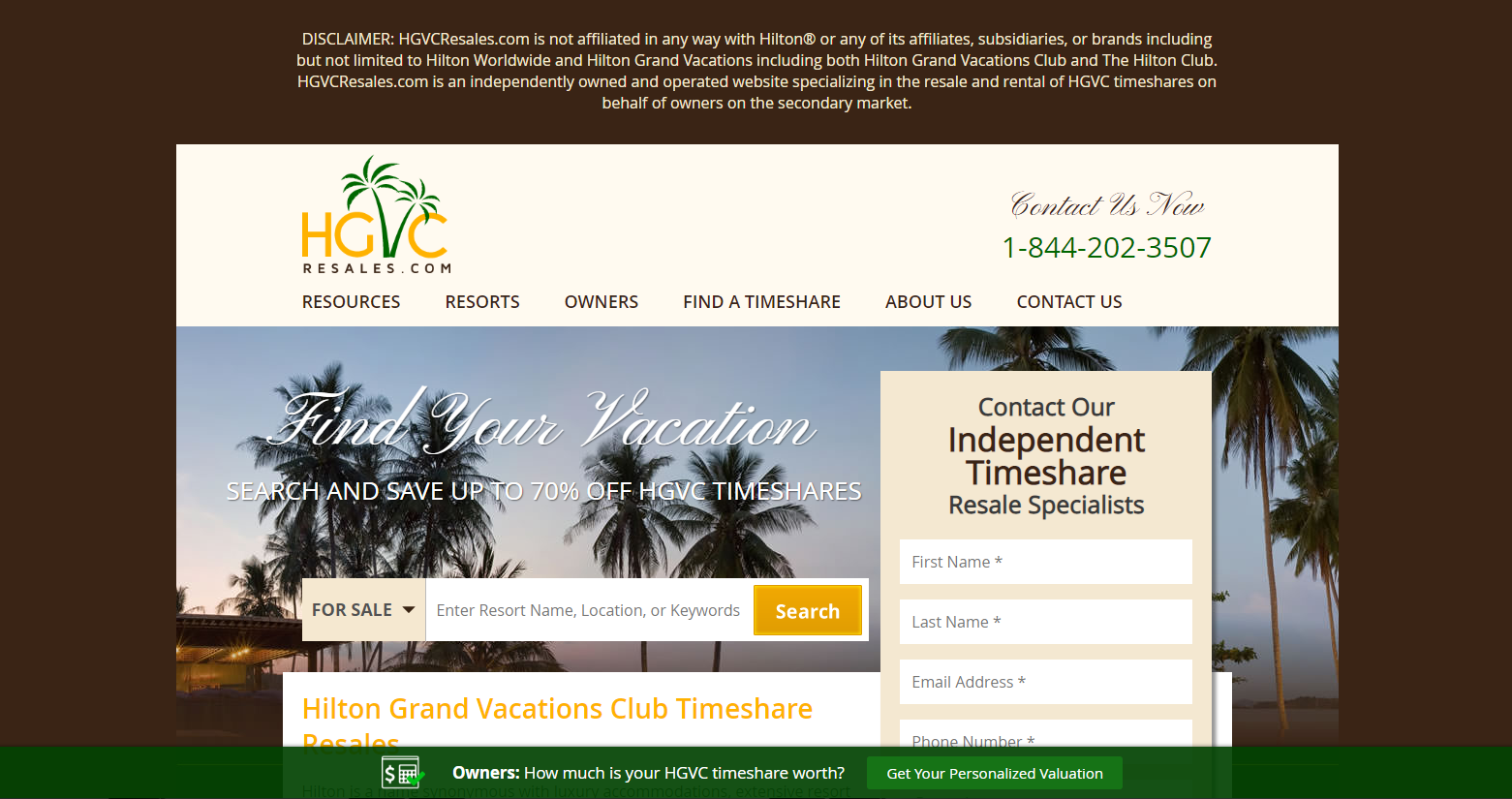
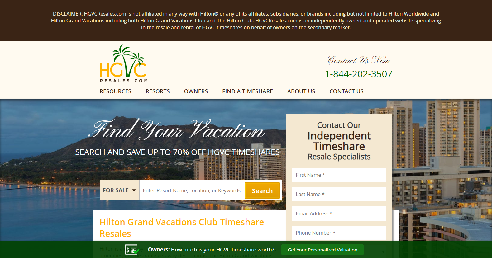
Widening the home page experience will motivate users to be more interactive with the page, while giving the site a more modern look. The changes would also draw attention away from the top disclaimer (without editing that element), which may discourage some users from continuing to use the site. This test will also change the background image.
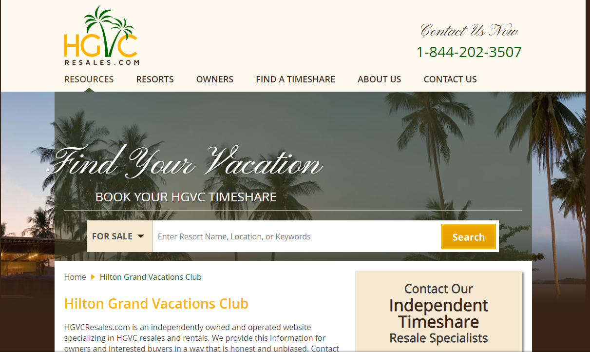
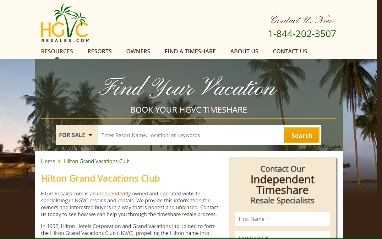
The top of most inner resources, resorts, and FAQ pages appears off-centered with some excessive margin-top formatting. In this test, we'll attempt to improve the user experience by centering and increasing the prominence of these items.