- 04/09/2018 - 04/20/2018 (11 days)
- www.givebacktimeshare.com
- Owner
- Homepage
- Form Fill
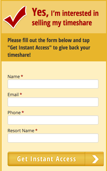
Form Header (Mobile)
Description / Hypothesis
Changing the text above the main lead form for mobile visitors will help instruct more people to complete the desired task and submit their information. This experiment could potentially help inform more mobile-only tests as we roll out more responsive design web properties.
Variations

Test Dashboard
Post-Mortem Analysis
This test could’ve failed for a variety of reasons. The lack of Paid traffic to the experiment limited the amount of data we could collect, resulting in a near total reliance on Organic traffic.
Aside from the weak number of sessions, the variant’s new headline likely pushed the submit button further below the fold on many mobile devices, which could have deterred some users. The variant also got rid of “assistance” language in the current control headline, which has proved favorable among our audiences, especially those who are older (the Ebook cover test seemed to signal the bulk of our visitors are likely 60 or older).
We should continue to test different headline and copy variations among mobile audiences, but should perhaps double-down on indicators that push assistance or guidance rather than obvious low-hanging fruit like “right on your phone” or “tap here to get rid of your timeshare.”